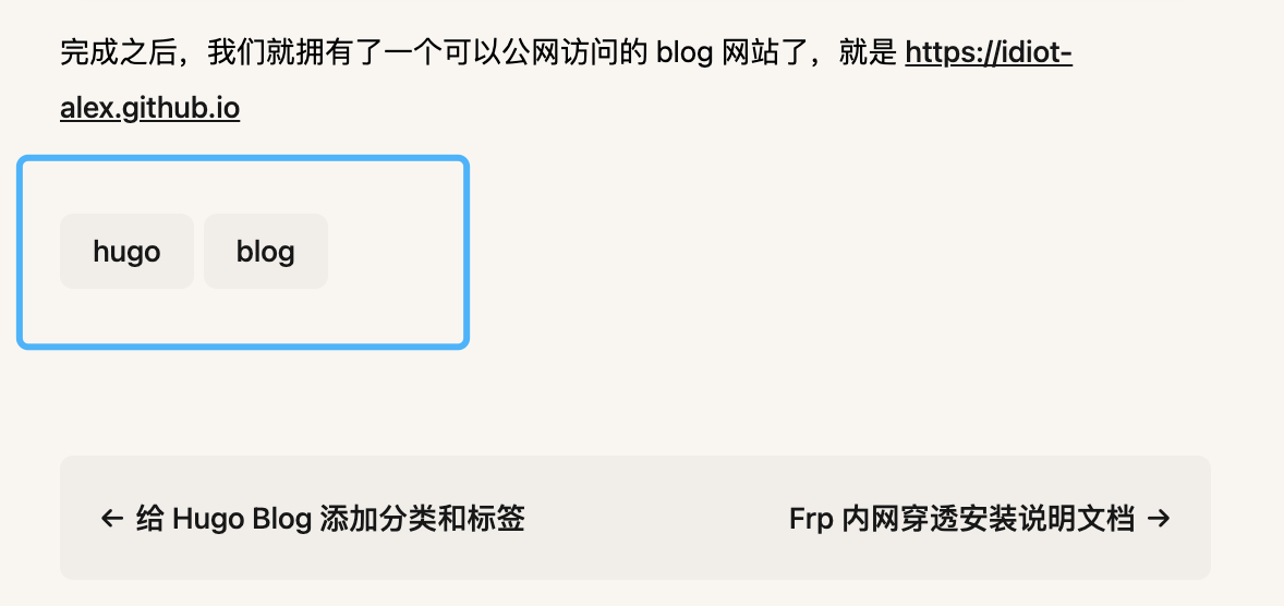
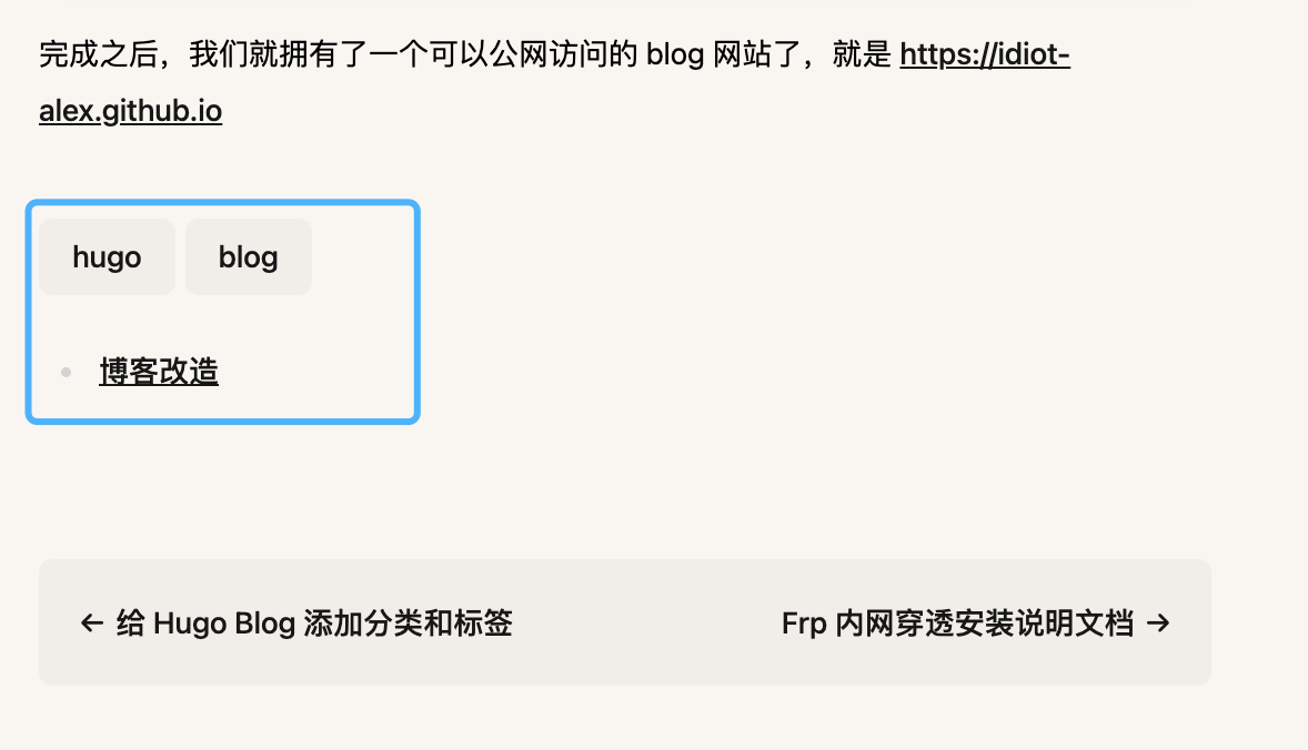
给 Hugo Blog 添加分类和标签
0. 序
不久前把自己心心念念的 Blog 搭建起来了,但是不能给文章添加标签和分类,显得不够友好。
搜了下资料,发现 Hugo 可以给文章添加标签和分类,那就把这个功能用起来吧,优化下我的 Blog。
1. 开启分类功能
默认情况下,Hugo 就支持分类和标签,就算不填写下面的配置也会生效:
# 在 hugo.toml 配置文件里面
[taxonomies]
  category = 'categories'
  tag = 'tags'
如果想要关闭分类和标签,需要添加下面的配置:
# 在 hugo.toml 配置文件里面
disableKinds = ['taxonomy', 'term']
当开启分类和标签功能之后,还需要在文章中添加对应的信息,像下面这样(在 new-hugo-blog.md 文件中):
---
title: "使用 Hugo 建立自己的 Blog"
date: 2023-07-01T11:25:40+08:00
tags: ["hugo", "blog"]
categories: ["博客改造"]
draft: false
---
如果运气好的话,启动 hugo 之后就能在文章内容底部看到设置的标签了。
为啥说是运气好呢?
是因为这个设置跟我们使用的主题有关系,我目前使用的 paper 主题,从上面的结果上看就只能看到 tags 生效了,但是 categories 并没有生效。
当我们使用的主题不满足我们需求时,就需要考虑自己替换这部分主题的模板了。
在 themes/paper/layouts/_default/single.html 文件里面(paper 换成你自己使用的主题名),我们可以找到配置分类和标签的地方,类似下面这样的代码:
<!-- Post Tags -->
{{ if .Params.tags }}
<footer class="mt-12 flex flex-wrap">
  {{ range .Params.tags }} {{ $href := print (absURL "tags/") (urlize .) }}
  <a
    class="mb-1.5 mr-1.5 rounded-lg bg-black/[3%] px-5 py-1.5 no-underline dark:bg-white/[8%]"
    href="{{ $href }}"
    >{{ . }}</a
  >
  {{ end }}
</footer>
{{ end }}
简单的描述下就是把文章中的 tags 属性值遍历输出来展示在页面上,而不显示 categories 的原因也是因为没有类似的代码。
为解决这个问题,我们直接把主题下面的 single.html 文件复制到 layouts/_default/single.html,并且添加一段新代码来展示 categories 属性:
<!-- Post Categories -->
{{ with .Params.categories }}
<ul id="categories">
  {{ range . }}
    <li><a href="{{ "categories" | absURL}}/{{ . | urlize }}">{{ . }}</a> </li>
  {{ end }}
</ul>
{{ end }}
重新访问页面,效果如下:
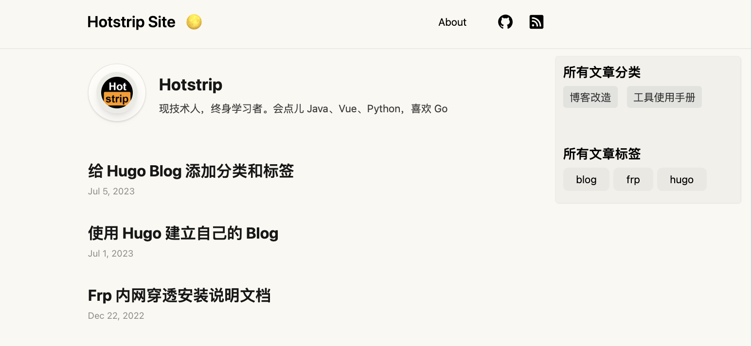
2. 调整分类标签的位置
从效果图上看,分类和标签展示在了文章内容底部,不大符合我的预期。
我更希望分类和标签能够显示在侧边,并且不会随着内容的滚动而消失。
有了前面的基础,我们这次直接修改 layouts/_default/baseof.html 页面,引入一个新的页面,就叫做 right-panel.html 吧,这个文件放到 layouts/partials 目录,这个文件内容如下:
<div class="right-panel mt-3 mr-4 p-3">
  <!-- 当前页面是文章内容页面 -->
  {{ if in .File.Dir "posts" }}
    <!-- Post Categories -->
    {{ with .Params.categories }}
    <h2 class="categories-title">文章分类</h2>
    <ul class="categories">
      {{ range . }}
        <li><a href="{{ "categories" | absURL}}/{{ . | urlize }}">{{ . }}</a> </li>
      {{ end }}
    </ul>
    {{ end }}

    <!-- Post Tags -->
    {{ if .Params.tags }}
    <div class="mt-12 flex flex-col">
      <h2 class="tags-title">文章标签</h2>
      <footer class="flex flex-wrap">
        {{ range .Params.tags }} {{ $href := print (absURL "tags/") (urlize .) }}
        <a
          class="mb-1.5 mr-1.5 rounded-lg bg-black/[3%] px-5 py-1.5 no-underline dark:bg-white/[8%]"
          href="{{ $href }}"
          >{{ . }}</a
        >
        {{ end }}
      </footer>
    </div>
    {{ end }}
  {{ else }}
    <!-- 当前页面不是文章内容 -->
    <!-- All Categories -->
    {{ with .Site.Taxonomies.categories }}
    <h2 class="categories-title">所有文章分类</h2>
    <ul class="categories">
      {{ range $name, $taxonomy := . }}
        <li><a href="{{ "categories" | absURL}}/{{ $name | urlize }}">{{ $name }}</a> </li>
      {{ end }}
    </ul>
    {{ end }}

    <!-- All Tags -->
    {{ if .Site.Taxonomies.tags }}
    <div class="mt-12 flex flex-col">
      <h2 class="tags-title">所有文章标签</h2>
      <footer class="flex flex-wrap">
        {{ range $name, $taxonomy := .Site.Taxonomies.tags }} {{ $href := print (absURL "tags/") (urlize $name) }}
        <a
          class="mb-1.5 mr-1.5 rounded-lg bg-black/[3%] px-5 py-1.5 no-underline dark:bg-white/[8%]"
          href="{{ $href }}"
          >{{ $name }}</a
        >
        {{ end }}
      </footer>
    </div>
    {{ end }}
  {{ end }}
</div>
从代码上可以看到,整体内容分为两部分:
- 如果是文章页面,就显示该文章定义的分类和标签
- 如果不是文章页面,就显示本博客网站所有文章的分类和所有文章的标签
可以通过当前文件的目录来判断是否是文章页面:如果是文章页面,它的目录肯定是在 content/posts 里面,我们通过 .File.Dir 变量获取到文件的目录
然后在 layouts/_default/baseof.html 页面引入进来:
<!-- ..... -->
<!-- right panel for categories and tags-->
{{ partial "right-panel.html" . }}

{{ partial "footer.html" . }}
最后调整下 custom.css 文件的样式内容:
.right-panel {
  position: fixed;
  top: 5rem;
  right: 0;
  width: calc((calc(100vw - 48rem)) /2);
  border: 1px solid #ebebe5;
  border-radius: 5px;
  box-shadow: 1px 1px #eceaea;
  background-color: rgb(0 0 0/3%)
}

.mr-4 {
  margin-right: 1rem/* 16px */;
}

.categories {
  list-style: none; /* 去掉默认的列表样式 */
  margin: 0;
  padding: 0;
}

.categories li {
  display: inline-block; /* 将列表项变成行内块元素 */
  margin-right: 10px; /* 制造列表项之间的间隔 */
  margin-bottom: 10px;
}

.categories li a {
  display: block; /* 将链接变成块级元素,使其可以占据整个列表项 */
  padding: 5px 10px; /* 为链接添加内边距,让其区域更大,更容易点击 */
  background-color: #e2e2de; /* 添加背景色 */
  color: #333; /* 添加文字颜色 */
  text-decoration: none; /* 去掉下划线 */
  border-radius: 5px; /* 添加圆角 */
}

.categories li a:hover {
  background-color: #333; /* 鼠标悬停时改变背景色 */
  color: #fff; /* 鼠标悬停时改变文字颜色 */
}

.categories-title {
  margin-bottom: 10px;
  font-size: 20px;
  font-weight: 600;
}

.tags-title {
  margin-bottom: 10px;
  font-size: 20px;
  font-weight: 600;
}
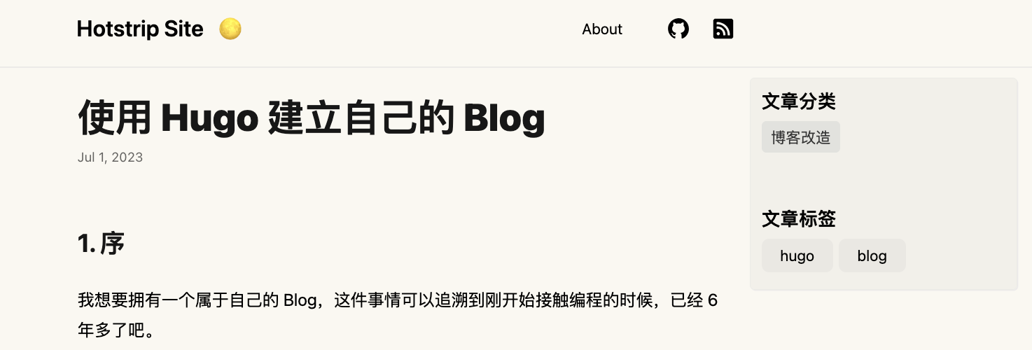
最后看看效果(非文章页面和文章页面都会显示分类和标签):
3. 固定头部
搞定了分类和标签,但是每篇文章的内容在滚动时会把头部顶上去,我想把头部固定不随着页面滚动而消失。
跟调整分类和标签部分的方法一样,首先找到主题下对应的页面,然后把页面复制到 layouts 目录里面去。
比如我使用的是 paper 主题,就把 themes/paper/layouts/partials/header.html 文件复制到 layouts/partials/header.html,然后在这里面去修改样式就行。
<!-- 修改之前的代码 -->
<header class="mx-auto flex h-[5rem] max-w-3xl px-8 lg:justify-center">
  <!-- 省略其他内容 -->
</header>

<!-- 修改之后的代码 -->
<header class="fixed mx-auto w-screen header-bg border-bottom">
  <div class="mx-auto flex h-[5rem] max-w-3xl px-8 lg:justify-center">
  <!-- 省略其他内容 -->
  </div>
</header>
可以看到,我就只是把原来的 header 标签换成了 div 标签,然后外面套了一层 header 标签,给它添加上我需要的样式,比如固定定位、设置宽度、加点边框等。
新增的样式可能不生效,就在 assets 目录下面新增一个 custom.css 文件,然后在这个文件里面写样式内容。下面是一些参考的样式:
/* Place custom css here. */
img {
  border: 0.5rem solid #ebebe5;
  border-radius: 1rem;
  --tw-shadow: 0 10px 15px -3px rgb(0 0 0 / 0.1), 0 4px 6px -4px rgb(0 0 0 / 0.1);
  --tw-shadow-colored: 0 10px 15px -3px var(--tw-shadow-color), 0 4px 6px -4px var(--tw-shadow-color);
  box-shadow: var(--tw-ring-offset-shadow,0 0 #0000),var(--tw-ring-shadow,0 0 #0000),var(--tw-shadow);
}

article pre {
  margin-left: 0rem;
  margin-right: 0rem;
}

article blockquote {
  margin-left: 0rem !important;
}

.w-screen {
  width: 100vw;
}

.header-bg {
  background: var(--bg);
  z-index: 10;
}

.border-bottom {
  border-bottom: 1px solid #ebebe5;
}

/* main 部分文章内容往下移一点 */
.pt-28 {
  padding-top: 7rem;
}

.min-h-\[calc\(100\%-5rem\)\] {
  min-height: calc(100% - 5rem);
}
我这里目前调整了头部的定位、背景;给图片添加上了圆角和阴影;给代码块调整了占位宽度(原本的样式会导致代码块不会和段落对齐,感觉很难看);引用块也是一样。
完成之后的效果如下: