给 Hugo Blog 添加文章导航
0. 序
上一篇给我的 Blog 添加分类和标签,这次给文章添加标题导航。
1. 给文章添加导航
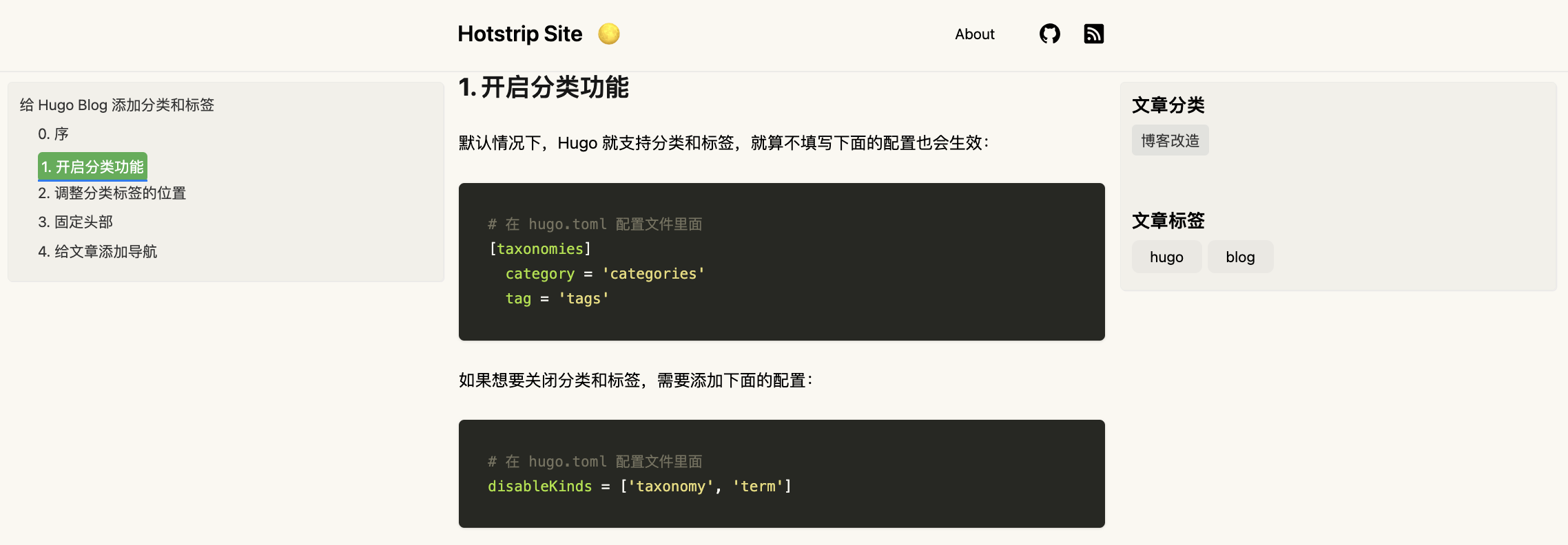
文章的右边部分已经有了显示分类和标签的内容,但左边还是空白的,我希望能显示该文章每一小节的小标题,并且点击能跳转到小标题对应的位置上去。
那么跟右边的内容类似,新增一个 left-panel.html,并且引入到 baseof.html 页面中。
<!-- left panel for navigation -->
{{ partial "left-panel.html" . }}
在 left-panel.html 页面中借助 js 来获取文章所有的标题,添加锚点显示在页面上。
<!-- 当前页面是文章内容页面 -->
{{ if in .File.Dir "posts" }}
  <div class="left-panel mt-3 ml-4 p-3">
    <!-- Post navigation -->
    <div id="nav"></div>
    <script type="text/javascript">
      // 获取固定头部的高度
      let fixedHeaderHeight = document.getElementById('fixed-header').getBoundingClientRect().height;
      // 获取内容容器
      let content = document.getElementsByTagName('article')[0];
      // 获取导航容器
      let nav = document.getElementById('nav');

      // 遍历所有 h1-h6 元素
      for (let i = 1; i <= 6; i++) {
        let hs = content.getElementsByTagName('h' + i);
        for (let j = 0; j < hs.length; j++) {
          // 创建导航链接
          let link = document.createElement('a');
          link.className = 'anchor text-black dark:text-white';
          link.innerHTML = hs[j].innerHTML;
          link.href = '#' + hs[j].id;

          // 创建导航项
          let item = document.createElement('div');
          item.className = 'nav-item mt-2';
          item.style.paddingLeft = ((i-1) * 20) + 'px'; // 设置层级缩进
          item.appendChild(link);

          // 将导航项添加到导航容器中
          nav.appendChild(item);
        }
      }

      // 获取所有包含锚点的链接
      let links = nav.getElementsByTagName('a');
      for (let i = 0; i < links.length; i++) {
        // 如果链接中包含 #,则表示它是一个锚点链接
        if (links[i].hash) {
          let decodedHash = decodeURIComponent(links[i].hash.slice(1)); // 对锚点ID进行解码
          let target = document.getElementById(decodedHash);
          // 如果该锚点元素存在,则在点击链接时,将页面滚动到目标元素的正确位置
          if (target) {
            links[i].addEventListener('click', function(e) {
              e.preventDefault(); // 阻止页面跳转

              location.hash = this.hash; // 更新页面 URL 中的锚点

              let targetTop = target.getBoundingClientRect().top + window.scrollY; // 获取目标元素的顶部位置
              let scrollTo = targetTop - fixedHeaderHeight + 1; // 计算页面滚动的位置

              // 使用平滑滚动效果滚动页面
              window.scrollTo({
                top: scrollTo,
                behavior: 'smooth'
              });
            });
          }
        }
      }

      // 获取导航条和所有锚点
      const navLinks = document.querySelectorAll("#nav a");
      const anchors = document.querySelectorAll('article h1, article h2, article h3, article h4, article h5, article h6');

      // 监听滚动事件
      window.addEventListener("scroll", () => {
        // 获取当前滚动位置
        const currentScrollPos = window.pageYOffset;

        // 遍历所有锚点,找到当前位于视口中的锚点
        anchors.forEach((anchor) => {
          const sectionTop = anchor.offsetTop;

          if ((currentScrollPos + fixedHeaderHeight) >= sectionTop) {
            // 给当前视口中的锚点所对应的导航项添加 active 类
            navLinks.forEach((link) => {
              if (!anchor.getAttribute("id")) {
                document.querySelectorAll("#nav a[href='#']")[0].classList.add("active");
              }
              if (link.getAttribute("href") == "#" + anchor.getAttribute("id")) {
                link.classList.add("active");
              } else {
                link.classList.remove("active");
              }
            });
          }
        });
      });
    </script>
  </div>
{{ end }}
上面的代码已经经过了多次优化,比如点击小标题时内容会自动滚动到对应的位置,并且不会被固定的头部遮挡。
对应的 custom.css 文件也会有一些新的样式:
.left-panel {
  position: fixed;
  top: 5rem;
  left: 0;
  width: calc((calc(100vw - 48rem)) /2);
  border: 1px solid #ebebe5;
  border-radius: 5px;
  box-shadow: 1px 1px #eceaea;
  background-color: rgb(0 0 0/3%)
}

 /* 给锚点添加下划线 */
a.anchor {
  position: relative;
  display: inline-block;
  text-decoration: none;
  color: #333;
  padding-bottom: 8px;
}

a.anchor::after {
  content: '';
  position: absolute;
  left: 0;
  bottom: 0;
  width: 0%;
  height: 2px;
  background-color: #0679f4;
  transition: width 0.3s ease;
}

/* 鼠标悬浮时下划线长度变化 */
a.anchor:hover::after {
  width: 100%;
}

/* 给导航条添加 active 类 */
a.active {
  background-color: #4caf50;
  color: white;
  padding: .25rem;
  border-radius: 5px;
}
最终的效果如下:
2. 响应式处理
虽然上面完成了在页面上显示导航的功能,但是一旦我们在移动端访问时,左右两边的内容就很丑,无法完整的显示。
考虑到移动端本身内容可见区就不大,展示额外的信息反而会污染整个文章内容,所以一旦内容宽度小于某个值(比如 1024px)之后就不再显示左右两边的导航和标签内容了。
我们在 custom.css 里面添加下媒体查询的样式代码:
@media screen and (max-width: 1023px) {
  .left-panel {
    display: none;
  }
  .right-panel {
    display: none;
  }
}
最终效果如下: